How to create tabbed forms and navigation in Power Apps using the Tab List control

Since March 2023, canvas Power Apps have been able to use modern controls in addition to the traditional controls familiar from the Power Apps UIs over many years. These new controls are the same ones used in model-driven apps. Microsoft describes the modern control benefits as follows:
- Modern look (based on Microsoft’s Fluent design model)
- Performance
- Accessibility (directly implement WCAG 2.1 level)
- Support own themes (sometimes in the future)
And they look good. Below is the form implemented with modern and traditional controls:


However, I haven’t personally used modern controls in production apps yet. Their modifiability has still been too limited, compared to what the classic controls offer. This has been a shame as there are some real gems amongst the new controls.
In October 2023, five of the modern controls became generally available. Also, many of the biggest shortcomings have now been fixed across the controls. Finally, you can modify the color of the controls!
This is a great reason to now start diving deeper into how the modern controls can be used in practice when implementing canvas app user interfaces. My personal favorite is the tab list control.
In this post I will show you the various ways in which the tab list control can improve the user experience of your canvas Power App:
- Breaking down a long form into multiple sections with their own tabs.
- Navigating between different pages in the app through a tab based menu.
- Presenting a responsive popup menu in a gallery list through a “see more” option behind three dots.
Going through this tutorial will help you present a high amount of information in a scalable way inside a canvas Power App. Using modern controls like the tab list will reduce the effort needed in configuring the details of various individual elements across the app.
Part 1: tabbed form sections
Let’s start by making an application that manages account information in Dataverse. The account form is really long with many fields, so we decided to divide it into several tabs to improve its usability.
We’ll go through the following steps:
- Configure app settings.
- Adding a header, gallery and forms.
- Using the tab list control to navigate between form tabs.
- Saving multiple forms at once and using a spinner during the event.
Creating and setting up Power Apps
Create a new canvas Power App. Let’s make it responsive. The first thing to do is switch off the Scale to fit settings on the application’s display settings:

Let’s add a new screen to the application. A ready-made Sidebar screen:

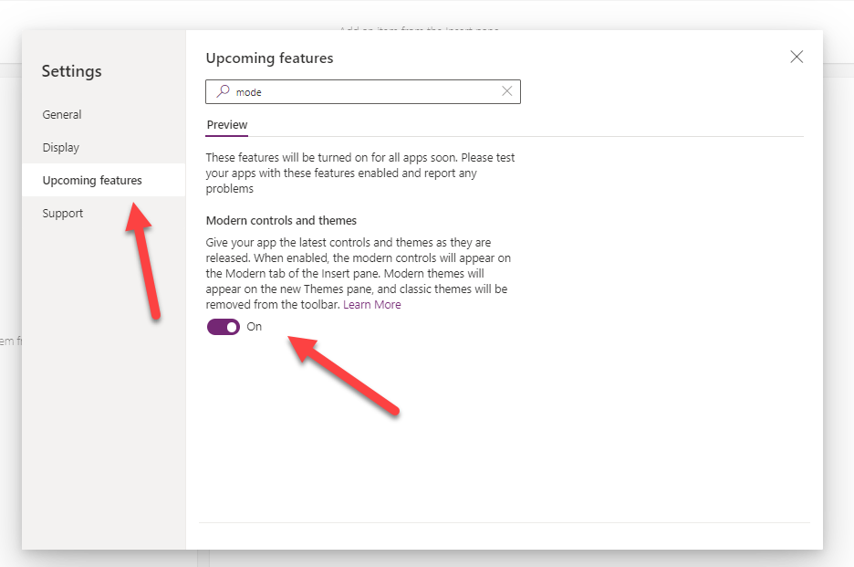
Modern controls are not (yet) enabled by default. Let’s go to the settings to enable them:
Now we can also use modern controls:

Header
Let’s start by adding a header control to our application:

The background color of the title bar (1), the title (2) and the displayed logo (3) are changed:

Gallery
A gallery will be added to the left column, listing all accounts from the Dataverse. There is no modern version of the gallery, so we have to settle for the traditional one:

Forms
A modern form is added to the screen’s content container. The form shows a few basic fields of the customer selected from the gallery.
Item: galAccounts.Selected
Let’s make two copies of the form and name the forms according to the information presented in them (frmbasic, frmContact, frmOther):

Let’s change the fields of the new forms to proper ones:

Thus, we have three forms, each maintaining an appropriate subset of the customer’s information.
Now you should be able to navigate between these forms.
Tab list
A tab list with values Basic, Contact and Other is added to the beginning of the content area.
Items: Table({Value:"Basic"},{Value:"Contact"},{Value:"Other"})At the same time, change the color of the list (Base palette color) to one your prefer:

Use of the tab list is neatly animated:

Finally, the visibility of each form is set to be determined based on the tab selected from the tab list.
Visible: TabList1.Selected.Value ="Basic"
Looking good!

The default selection for the tab list
We want to return to the first tab if the user changes the account s/he is editing.
Update the context variable (locSelecFirstTab) to true when the customer is selected.
OnSelect: Select(Parent); UpdateContext({locSelectFirstTab:true})
Set the default value of the tab list (DefaultSelectedItems) to “Basic”, if the user has selected the customer (locSelectFirstTab = true).
DefaultSelectedItems: If(locSelectFirstTab,Table({Value:"Basic"}))
When the user moves from one tab to another (OnChange event of the tab list), the value of the variable is set to false again.
OnChange: UpdateContext({locSelectFirstTab:false})
Saving changes
A button is added to the screen, by pressing it the changes made on all three forms are saved. This can be done with the following command.
Patch(Accounts, galAccounts.Selected, frmBasic.Updates,frmContact.Updates,frmOther.Updates)
Please wait, I am saving data…
Sometimes it takes a painfully long time to save data. For this, it is good to add a spinner to tell the user that the saving is in progress.
Best of all, you no longer have to do this yourself. It has its own ready-made control (Spinner).
Let’s add one above the form:

Set the desired color and text on the wheel.
Pressing the save button sets the variable (locShowWaitSpinner) to true. After the recording is complete, the value of the variable is returned to false.
UpdateContext({locShowWaitSpinner:true});
Patch(Accounts, galAccounts.Selected, frmBasic.Updates,frmContact.Updates,frmOther.Updates);
UpdateContext({locShowWaitSpinner:false});
This way, the spinner is only visible when the recording is in progress (locShowWaitSpinner = true).

Hide the tab list for the duration of the save:

The same is done for forms:

Part 2: tabbed app navigation
In addition to splitting the form of a single app screen into multiple tabbed sections, we want to offer a similar tab based experience for moving between different screens. For this, we can insert the tab list control under the app header and show it persistently as a command bar that indicates the current screen plus other available screens to move to.
Let’s start by adding another screen to our app. In practice, a copy of the recent one, but for managing contacts instead. Change the data source to Dataverse contacts table, replace the form fields with relevant ones for a contact. We’ll settle for two form tabs, “Basic” and “Other”.

Now we needed a way to navigate between the two screens.
A new named formula (MainNavigationItems) is added, which contains the headings presented in the navigation (Value) and their corresponding display controls (Screen).
Formulas: MainNavigationItems = Table({Value:"Accounts", Screen:'Accounts Screen' },{Value:"Contacts", Screen:'Contacts Screen'});
A new tab list is added to the screen, inside the Header Container above the actual data content. We set the container direction to be vertical and increase the height of the container to make room for both the header and tab list controls.
The items for the tab list are the formula we just created (MainNavigationItems).
Items: MainNavigationItemsWhen moving from one tab to another (OnChange), we navigate to the screen corresponding to the selected tab.
OnChange: Navigate(Self.Selected.Screen)In the tab list, the tab corresponding to the active screen is selected by default.
DefaultSelectedItems: LookUp(MainNavigationItems, Screen = App.ActiveScreen)
Let’s copy this tab navigation control to both screens.
Let’s also set the tab list controlling the forms to show the first tab every time it comes to the screen (OnVisible):

Ready!

Part 3: Responsiveness and popup menu in a gallery
One of the neat features of the tab list is its responsiveness. This helps in not only scaling it to a high number of tabs in a small sized screen – it also offers a creative way to build a custom popup menu.
Let’s see the standard features in action first. To do this, we’ll expand our navigation bar with more items to simulate a more complex app with plenty of screens to choose from:

What if all the tabs don’t fit on the screen? Three dots appear at the end of the list. The rest of the items can be found behind the dots:


Using this feature, it is finally possible to add pop-up menus to the gallery rows. Ones that are automatically positioned correctly on the screen. I borrowed this idea from Reza Dorran’s video.
Let’s add a tab list to the gallery, the values are different actions to be performed on the row.
Items: Table({Value:"Edit"}, {Value:"Delete"}, {Value:"Open LinkedIn profile"})
However, the tab list is set so small that not even the first tab is visible. Only three dots will be visible.
Now the menu pops up on the screen automatically in the right place:

In the tab list’s OnSelect event, you can define what happens with different selections:

Summary
With the latest updates, modern controls are finally usable in canvas apps as well. Using them, it is easy and fast to create modern-looking responsive applications. They still aren’t as flexible as the old controls, but they don’t always have to be.
Once Microsoft gets to releasing customizable themes for modern controls, I’ll start to be really satisfied with these enhancements.
This is great! I was wondering how the submit button syntax would work if you’re saving a new record.