Creating a heat map in Power Apps
Large sales projects etc. are often subject to a very comprehensive risk assessment. One important element in the assessment is the probabilities of the risks (probability, likelihood) and their effects if they materialize (impact).
This pair is often described by a heat map. Risks with a high probability and impact are located in the upper right corner. At the bottom left are risks with a low probability and a modest impact.

This time we are implementing such a heat map with Power Apps.
Storing the risks (Dataverse)
The risks of the different projects are stored in a separate table in Dataverse. Fields of interest are Impact and Probability.

Let’s first create a few example rows of data, so we can start.

Creating the heat map
The goal is to form a 9×9 heat map on the impact and probability axes (the evaluation interval used is 1-9). For this, we need a collection that includes the necessary 81 pairs of numbers as the basis.
The first things that come to mind are
- Using the Sequence function to create values for probabilities 1-9
- Going through the created values (ForAll) and for each create values 1-9 for the impacts and go through them accordingly
- In the innermost loop adding the probability + effect pair to a new collection
ForAll(RenameColumns(Sequence(9), "Value", "ProbabilityValue"),
     ForAll(RenameColumns(Sequence(9), "Value", "ImpactValue"),
         Collect(colHeatMap,{Probability:ProbabilityValue,Impact:ImpactValue})
     )
)
Like so.

This requires a collection to be created. Let’s do this in an elegant way that I learned from Brian Dang’s great video, where he introduces how to make a game with Power Apps.
First, let’s create a table that contains the possible values of the impacts (1-9).

A new column called “ProbabilityTable” is then added to the table with AddColumns. The new column is a table that contains the probability value set (1-9).

Finally, the table containing the probabilities is decomposed into its own rows with the Ungroup function. And just like that, we have 81 lines including all impact-probability pairs. You can set the formula as the value of the Items property in a gallery.

Let’s add a text field to the gallery whose value is the impact+probability values of that cell. This makes it easier for us to understand what we are doing.

The scale we use is 1-9, so set the Wrap count of the gallery to 9.

This is already starting to take shape! Let’s arrange the values in our table in the correct order and add headings to the axes.
The final formula for the contents of the gallery is the following.
SortByColumns(
  Ungroup(
     AddColumns(
        RenameColumns(Sequence(9),"Value", "Impact"),
        "ProbabilityTable", RenameColumns(Sequence(9),"Value", "Probability")
        ),
     "ProbabilityTable"
     ),
  "Impact",Descending,"Probability",Ascending
)
Heat map colors
The heat map template is ready, but the cells still need to be colored.
Format the gallery cells to a suitable size and set the space between them (Template padding) to zero. The cell background color (TemplateFill) is set to dark blue (RGBA (56, 96, 178, 1)).

The last parameter in the color definition adjusts the color transparency. Let’s take advantage of this.
In the upper right corner, the sum of the probability and the impact is 18. Let’s define the color so that its transparency is 1 in this case (i.e., not transparent at all), and in other cases gradually less, and finally in the lower left corner almost 0.
RGBA(56, 96, 178, (ThisItem.Impact+ThisItem.Probability)/18)
At the same time, let’s delete the title from inside the gallery. We should be able to do without it now.
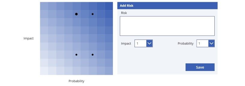
Placing risks on the heat map
The risks entered by the user should still somehow be placed on this map.
We will query each heat map cell to find if there are any risks stored for that probability-impact pair. In practice, this means doing 81 queries. For this reason, the risks should be stored in a collection when the screen is opened (OnVisible). Otherwise, loading the heat map will be really slow.

Let’s add a small black circle to the cells of the gallery and place it in the center of each cell.

The circle is only visible if there is a risk with the cell values (impact and probability).
Not(
  IsBlank(
    LookUp(
      colRisks,Impact = ThisItem.Impact And Probability = ThisItem.Probability
    )
  )
)
Changing the size of the circles based on the number of risks
In our example data, there are two risks with the value pair impact = 8 and probability = 5. It would be more elegant to also visualize how many risks a circle contains.
This is done by increasing the size of the circle to match the number of risks found.
Let’s add a text field to the gallery, the value of which is the number of risks corresponding to that cell. This is because we take advantage of the number of risks in several places, but we only want to query our collection once.
CountRows(
  Filter(
    colRisks, Impact = ThisItem.Impact And Probability = ThisItem.Probability
  )
)
Let’s change the visibility of the circle to depend on the number of risks found (the ball is displayed if more than 0 risks were found).

Now let’s adjust the width of the ball according to personal preference. I set the width to 7.5 and add 2.5 to it for each risk found.

The easiest way to handle the height is by referring to the width of the circle.

The circles are not always automatically in the middle of the cells, because their width varies. Let’s fix this. In my example, the width and height of the cells is 45. So the center point is 22.5. When we subtract half the diameter of the circle from this, we get the correct position.

The same correction needs to be done with the Y-axis.
Presenting the information of the risks and adding new risks
The heat map is just a regular gallery, so information about a selected point can be displayed in another gallery as usual. Below is an example on how the data for a selected point could be presented.

It might also be necessary to provide the user with the opportunity to add new risks.
Like so.

Character colors instead of gradient
What if we wanted to use the traditional green-yellow-orange-red coloring? In this case, we would specify the desired logic in the TemplateFill property of the heat map gallery.
For example, like this
If(ThisItem.Impact = 1 Or ThisItem.Probability = 1 Or ThisItem.Impact+ThisItem.Probability<6, Green,
   If(ThisItem.Impact+ThisItem.Probability<12,Yellow,
      If(ThisItem.Impact+ThisItem.Probability<16,Orange,Red)))
Now the color is green if either one of the values is 1 or their sum is less than 6, yellow if the sum is less than 12, orange if the values are between 12-15 and red if more than that.

If the risks are linked to, for example, Dynamics 365 opportunities, this Canvas Power Apps can be easily integrated as part of the Opportunity form in a model-driven app. (For examples on other ways you can customize the sales process, see how we implemented opportunity scoring in our own CRM app.)