Power Apps and custom themes
Once your organization starts to have more than one Power Apps applications (and more than one maker) you may begin to wonder:
How could we make all these apps share the same look and feel?
It would be very useful to have our own custom theme. Luckily, this can be done already. Power Platform Center of Excellence Starter Kit has a tool for that, called the Theme Editor.
Let’s have a look at what these Center of Excellence theming components are and how we can utilize them in harmonizing the visual side of our apps.
Center of Excellence Theme Editor and Theme Gallery
Center of Excellence has two theming related tool.
- CoE Theme Editor for building themes
- CoE Theme Gallery for browsing and downloading themes

Use of these tools requires a Power Apps premium license (per app or per user plan).
You can use these theming components without any other parts of the Center of Excellence Starter Kit. But I recommended to install whole CoE package, as it’s full of many other useful tools.
Create your own theme
Let’s launch the Theme Editor app and create our own theme (Create new theme).

The theme has several properties:
- colors
- font type
- font size for emphasis and regular text (for both tablet and phone layout)
- border thickness and radius
Building a theme is easy. Just change the properties and you’ll see in the preview section how your theme will look like.

Seems very promising. Let’s make our own theme.
But… When we set our brand primary color as PrimaryColorValue2 everything turns to red:

A little bit too much for me. I was looking for something like this:

Unfortunately, you can’t define different colors for different controls.
Let’s try this anyway. Use the brand primary color as PrimaryColorValue3 and a suitable grey color as PrimaryColorValue2. The last thing is to change the font type to match your visual guideline.
I know, looks boring:

Publishing the theme
Next, we’d like to share this new theme with other makers. Clicking the Publish button doesn’t do the trick. You need to build downloadable theme files and add them as an attachment for the published theme.
After this the other makers can browse and download the theme by using the Theme Gallery App.
Using the theme
How does our theme look in practice?
First, we need to use the theme file to create a new Power Apps canvas app:

Now the App OnStart event reveals how our theme works. The theme colors and fonts are all stored into global variables:

Controls use these variables in their own properties:

The best thing is that the theme leverages nicely our main brand color stored in PrimaryColorValue3:

Even the Forms control looks much better, compared to the Theme Editor preview:

Same with out of the box screen templates:

Components inside the theme
The theme contains three generic components:
- Header
- Preloader
- TabControl

When using these, you should update the component styles property to point to the ComponentStyles collection (defined also on AppStart).
Yes. One more thing the App maker must remember to do:

For some reason these components don’t use our main color, though:

This can be easily fixed. Just add the following patch command at the end of AppOnStart.
Patch(ComponentStyles,LookUp(ComponentStyles, cat_name = "PrimaryColor2Value"), {cat_value:LookUp(ThemeStyles, Name = "PrimaryColor3Value").Value})After this the attached components also look in line with our theme:

What’s missing?
With the Center of Excellence theming components, you can ensure that all apps use the same main colors, font types and font size.
But it doesn’t make all your apps look the same.
This is why I personally like to make a few additions to the template file after it has been generated.
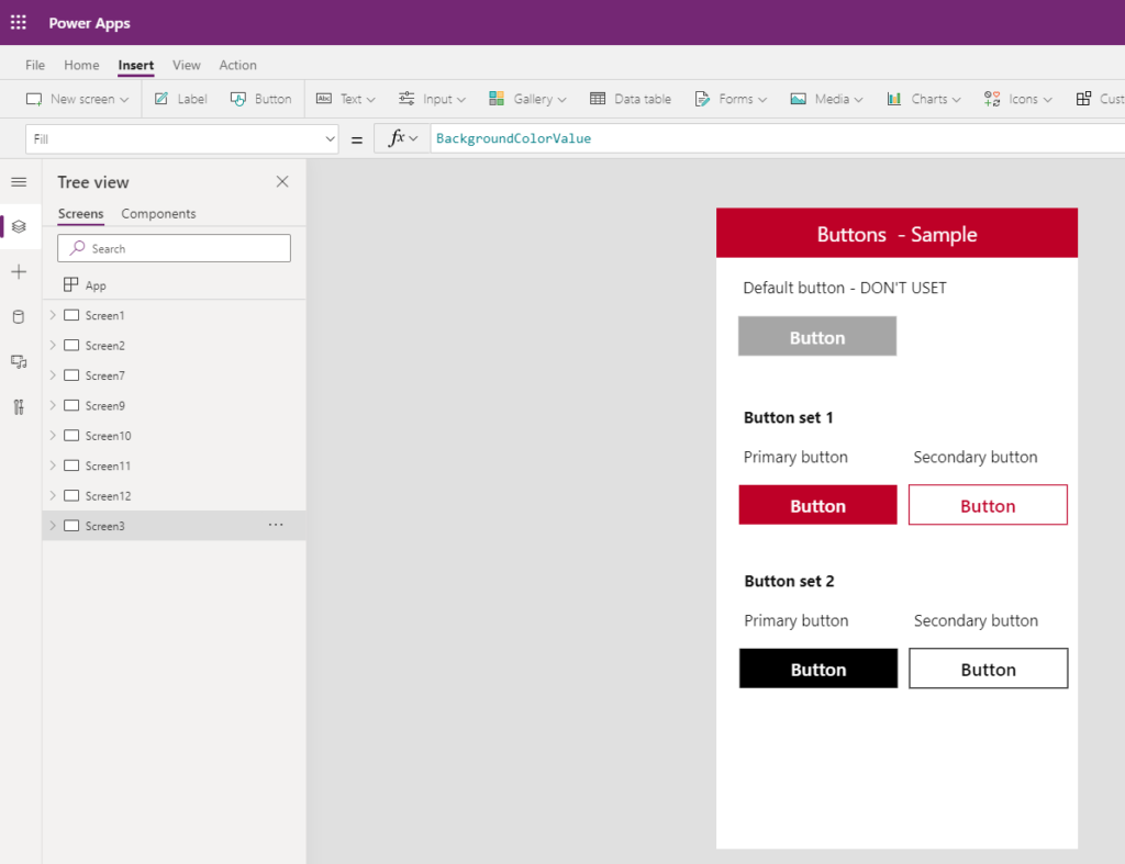
Buttons
Buttons are an essential part of the application UI. Our theme default buttons are grey. Instead of using them, I like to build an example screen where there is at least one version of the primary and secondary button.
Just copy-paste these buttons from here whenever needed:

Gallery
Galleries are another essential building block of Power Apps. It might be useful to provide a few examples of galleries with your organization’s UI details for the makers.
- How to navigate away from the item (icon/button)?
- How to separate items from each other (color/line)?
A few examples below:


You could continue with building examples of:
- Forms
- View item screen
- App header
- App footer
- etc.
Summary
The Center of Excellence Starter Kit theming tools aren’t the perfect solution for the common problem of having dozens of different looking Power Apps applications in your organization. But it’s way better than not having any themes that harmonize the visual appearance of apps built by your citizen developers.
This is just one example of an aspect you should be considering on your Power Platform journey.
Need help on yours? Contact us and let’s plan the right steps together!